Jen Richmond
home
about
blog
30daycharts
Categories
All
(3)
30daycharts
Want to support my chart making?
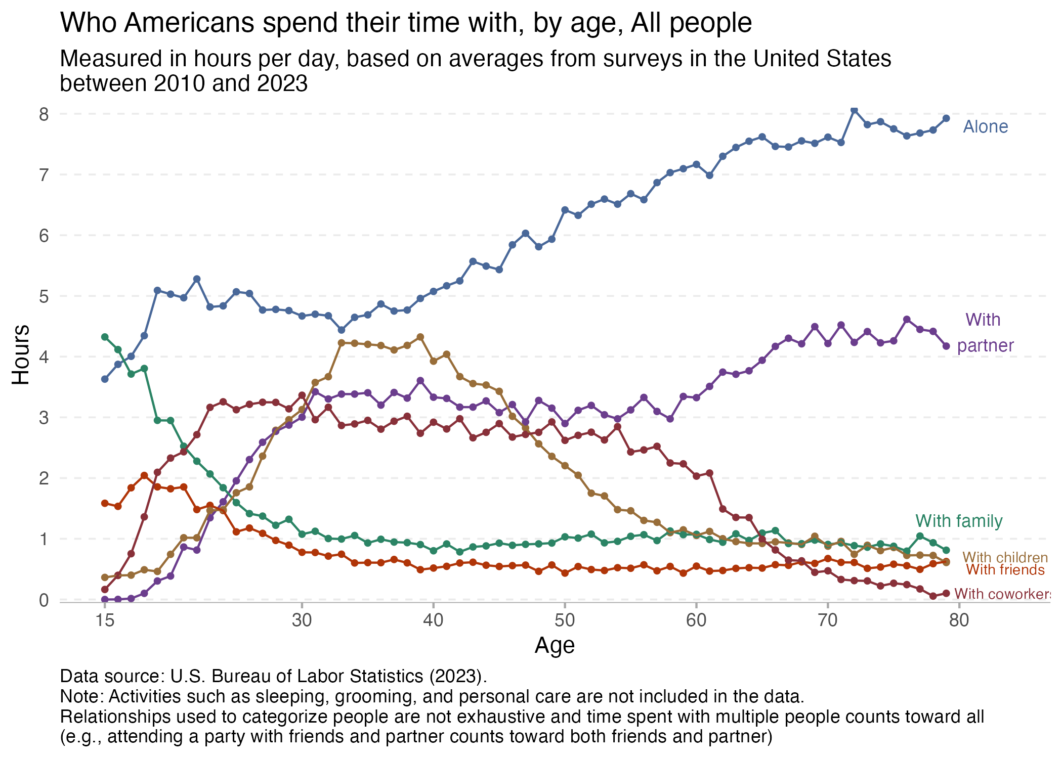
day 2 slope
This plot from Our World in Data illustrates the amount of time that we spend with others and how that changes with age. The slope of line plotting the amount of time that…
Jen Richmond
Apr 2, 2025
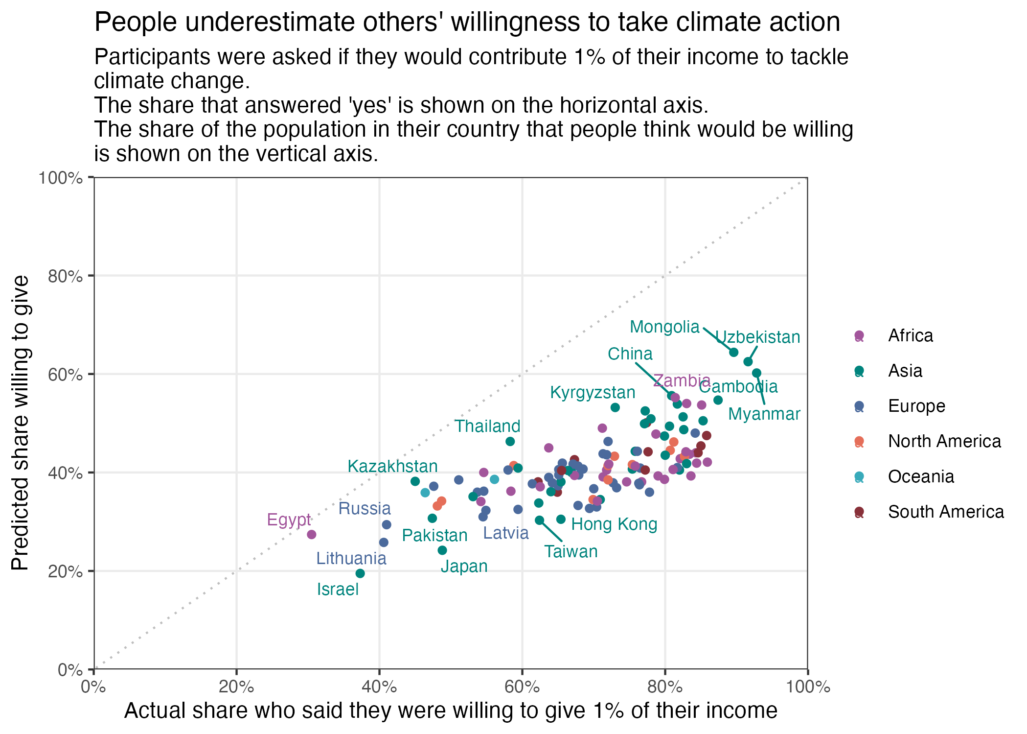
day 1 fractions
This plot from Our World in Data illustrates the proportion of people who are willing to donate 1% of their income to climate change efforts as a function of people’s…
Jen Richmond
Apr 1, 2025
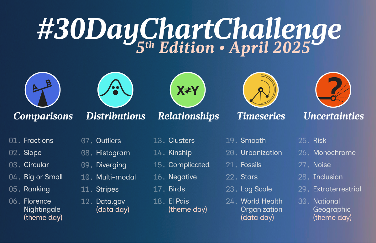
day 0 challenge
I have some time on my hands at the moment and thought the #30DayChartChallenge might be a good way to refresh my ggplot skills.
Jen Richmond
Mar 31, 2025
No matching items