library(owidapi)

catalog <- owid_get_catalog()

willingness <- owid_get("willingness-climate-action") day 0 challenge
I have some time on my hands at the moment and thought the #30DayChartChallenge might be a good way to refresh my ggplot skills.
The Our World in Data is a fun place to explore data visualisations. They always make really interesting plots out of all kinds of different data, but they use an in-house data viz platform called “Grapher” so it isn’t easy to find code that can be used to reproduce the charts.
My goal in April is use the 30 day chart challenge prompt to find a Our World in Data plot that looks interesting, and then to try to reproduce the plot using ggplot code.
I will post the final code for each plot in a tabset below, but if you want to see how each chart came about (i.e. my troubleshooting process), there will be a blog post associated with each one.
The owidapi package is an easy way to get access to the data sources that the Our World in Data site uses.
- Load the package and then use the
owid_get_catalog()function to get a dataframe of all the different plots that have been made. - Find one on the site that fits the 30 Day Chart Challenge prompt and then find the slug in your catalog dataframe and use that with the
owid_getto read the data from the API.
Day 1 fractions
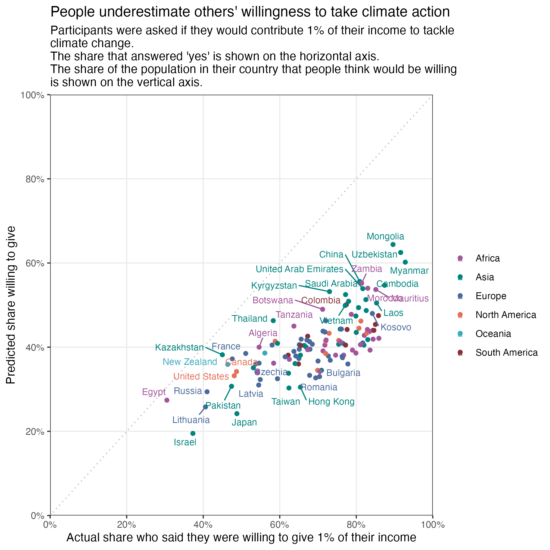
willingness2024 %>%
  filter(entity_name != "World") %>%
  ggplot(aes(y =  prediction_others_willingness, x = self_willingness, colour = region)) +
  geom_point() +
  scale_y_continuous(labels = percent_format(accuracy = 1, scale = 1),
                      limits = c(0,100), expand = c(0,0), breaks = seq(0,100,20)) +
    scale_x_continuous(labels = percent_format(accuracy = 1, scale = 1),
                       limits = c(0,100), expand = c(0,0), breaks = seq(0,100,20)) +
  labs(y = "Predicted share willing to give",
       x = "Actual share who said they were willing to give 1% of their income",
       title = "People underestimate others' willingness to take climate action",
       subtitle = "Participants were asked if they would contribute 1% of their income to tackle \nclimate change. \nThe share that answered 'yes' is shown on the horizontal axis. \nThe share of the population in their country that people think would be willing \nis shown on the vertical axis.") +
  theme_bw()  +
  easy_remove_gridlines(axis = "both", minor = TRUE, major = FALSE) +
  geom_abline(
    slope = 1,
    intercept = 0,
    color = "grey",
    linetype = "dotted") +
  scale_colour_manual(values = c("#a2559b", "#00847d", "#4b6a9c", "#e56e59", "#38aaba", "#883039")) +
  easy_remove_legend_title() +
  geom_text_repel(aes(label = entity_name), size = 3, max.overlaps = 20)
Day 2 slope
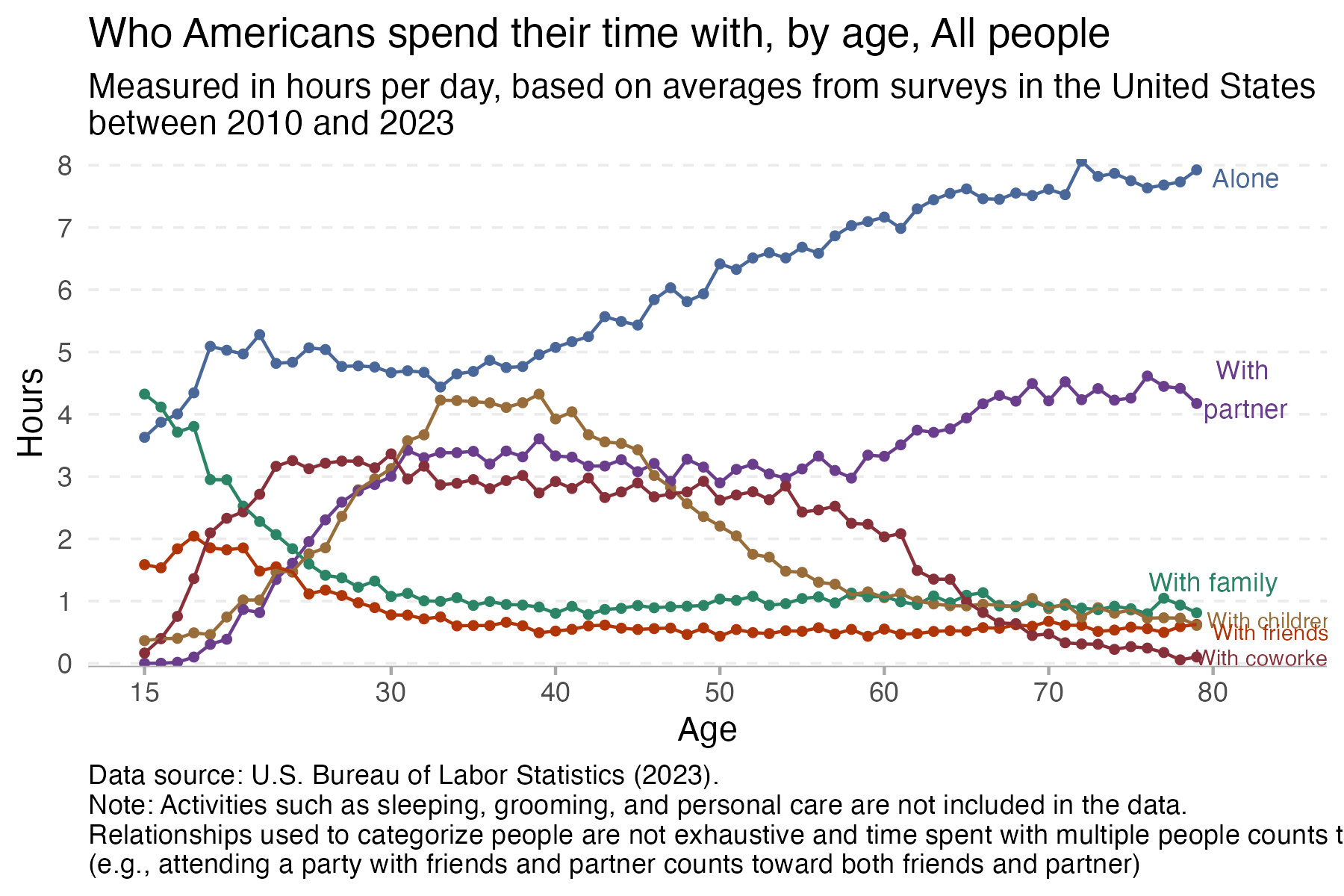
time %>%
  filter(age < 80) %>%
  filter(group == "All people") %>%
  ggplot(aes(x = age, y = hours, colour = category)) +
  geom_point(size = 1) +
  geom_line() +
  scale_colour_manual(values = c("#496899", "#6b3d8d", "#2b8465", "#986d39", "#b03508", "#883039")) +
  theme_minimal() +
  scale_y_continuous(expand = c(0,0), limits = c(-0.05,8.1), breaks = seq(0,9,1)) +
  scale_x_continuous(breaks=c(15,30,40,50,60,70,80)) +
  easy_remove_gridlines(axis = "x") +
  easy_remove_gridlines(axis = "y", major = FALSE, minor = TRUE) +
  theme(panel.grid = element_line(linewidth =  0.4, linetype = 2)) +
  theme(axis.ticks.x =  element_line(linewidth = 0.5, color="darkgrey") ,
        axis.line.x = element_line(linewidth = 0.2, colour = "darkgrey", linetype=1)) +
  easy_remove_legend() +
  ### the geom_text code below are created using the ggannotate package
  geom_text(data = data.frame(x = 82, y = 7.8,
    label = "Alone"), aes(x = x, y = y, label = label), size = 3, colour = "#496899") +
  geom_text(data = data.frame(x = 82, y = 4.4,
    label = "With \npartner"), aes(x = x, y = y, label = label), size = 3,colour = "#6b3d8d") +
  geom_text(data = data.frame(x = 80, y = 1.3,
    label = "With family"),aes(x = x, y = y, label = label), size = 3, colour = "#2b8465") +
  geom_text(data = data.frame(x = 83.5, y = 0.7,
    label = "With children"), aes(x = x, y = y, label = label), size = 2.5,colour = "#986d39") +
 geom_text(data = data.frame(x = 83.5, y = 0.5,
    label = "With friends"), aes(x = x, y = y, label = label), size = 2.5,colour = "#b03508") +
  geom_text(data = data.frame(x = 83.5, y = 0.1,
    label = "With coworkers"), aes(x = x, y = y, label = label), size = 2.5, colour = "#883039") +
  labs(title = "Who Americans spend their time with, by age, All people",
       subtitle = "Measured in hours per day, based on averages from surveys in the United States \nbetween 2010 and 2023",
       x = "Age",
       y = "Hours",
       caption = "Data source: U.S. Bureau of Labor Statistics (2023). \nNote: Activities such as sleeping, grooming, and personal care are not included in the data. \nRelationships used to categorize people are not exhaustive and time spent with multiple people counts toward all \n(e.g., attending a party with friends and partner counts toward both friends and partner)") +
  theme(plot.caption = element_text(hjust = 0)) # make the caption appear on the left
Day 3 circular

# insert ggplot codeDay 4 big small
# insert ggplot codeDay 5 ranking
# insert ggplot codeDay 6 florence
# insert ggplot codeDay 7 outliers
# insert ggplot codeDay 8 histogram
# insert ggplot code:::